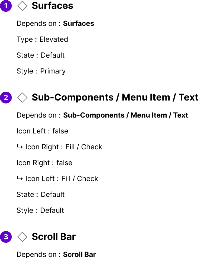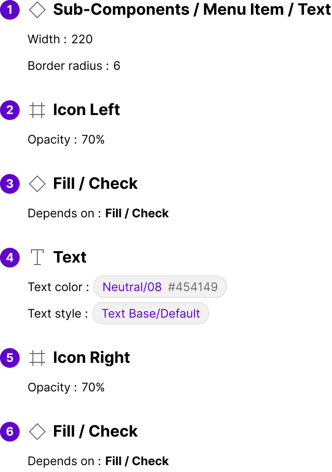
Component Library
Provide users with a list of options that can be selected by clicking or hovering over a trigger element. This component is commonly used for navigation menus, filtering options, and other UI elements that require a list of selectable items.