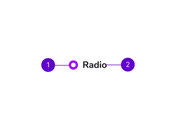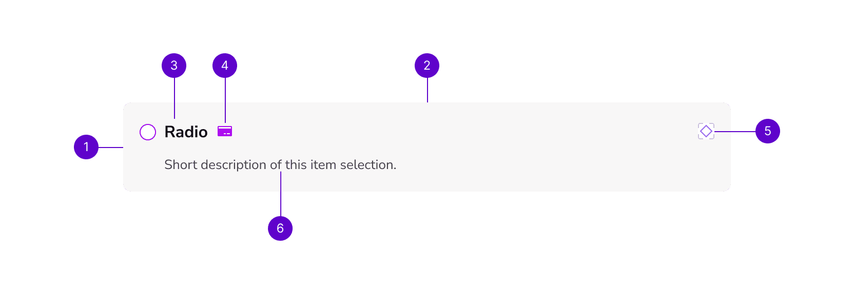
Component Library
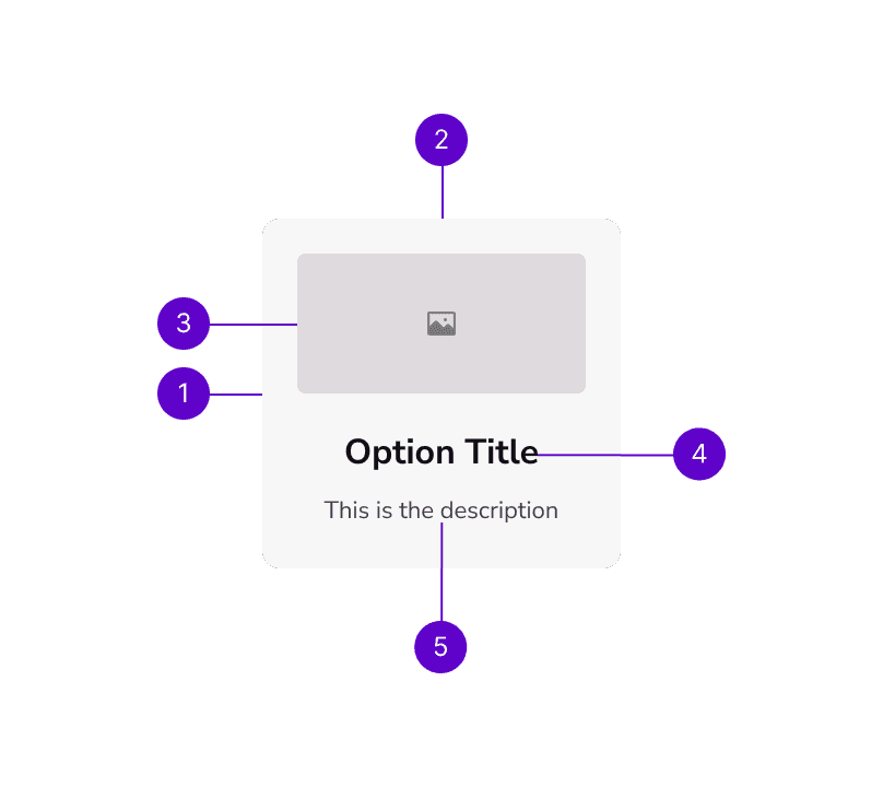
Allow users to select one option from a list of available choices. This component typically includes a small circle that can be selected or deselected, and a label that describes the option being selected.

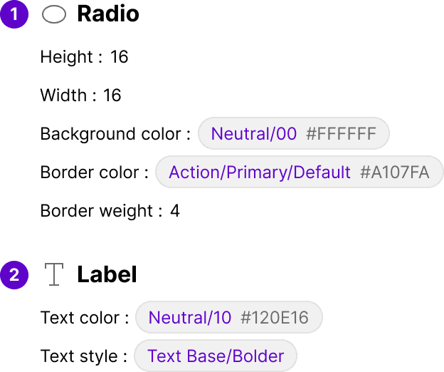
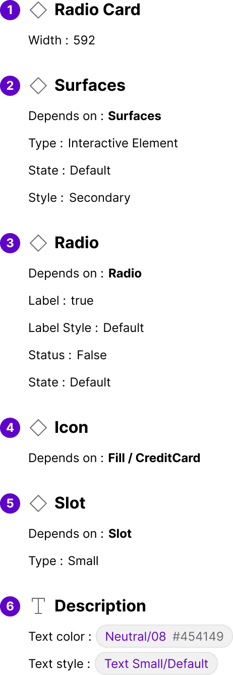
Component Library
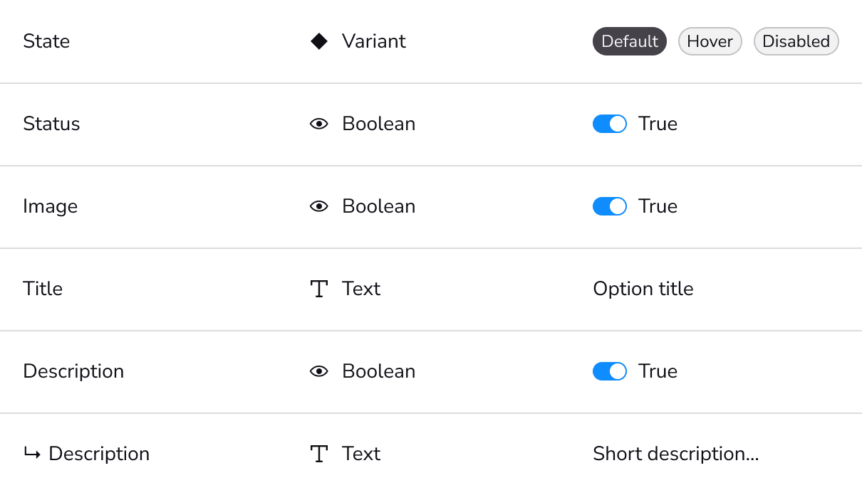
Allow users to select one option from a list of available choices. This component typically includes a small circle that can be selected or deselected, and a label that describes the option being selected.