Home

Components

Pricing

Help

Preview

Get CoreKit

Menu

Menu

Home

/

Component Library

/

Table

Component Library

Search

Documentation

Welcome to CoreKit
Batch Styler
Similayer
Customize Color Styles
Customize Typography Styles
Customize Component Styles

Styles

Colors
Elevations
Fills
Typography

Components

Accordion
Account
Alert
Announcement
Avatar
Breadcrumb
Button
Card
Checkbox
Chip
Dialog
Divider
Dropdown Menu
Form Stepper
Icons
Input
Modal
Navigation Links
Radio
Search
Segment Control
Select
Slider
Slot Component
Statuses
Surface
Tab
Table
Tag
Textarea
Toggle
Tooltip

Components

Accordion
Account
Alert
Announcement
Avatar
Breadcrumb
Button
Card
Checkbox
Chip
Dialog
Divider
Dropdown Menu
Form Stepper
Icons
Input
Modal
Navigation Links
Radio
Search
Segment Control
Select
Slider
Slot Component
Statuses
Surface
Tab
Table
Tag
Textarea
Toggle
Tooltip

Components

Accordion
Account
Alert
Announcement
Avatar
Breadcrumb
Button
Card
Checkbox
Chip
Dialog
Divider
Dropdown Menu
Form Stepper
Icons
Input
Modal
Navigation Links
Radio
Search
Segment Control
Select
Slider
Slot Component
Statuses
Surface
Tab
Table
Tag
Textarea
Toggle
Tooltip

Table

Table

Table

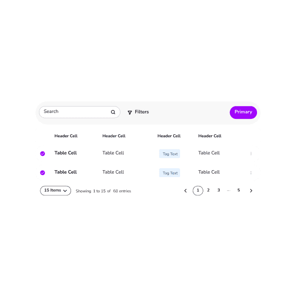
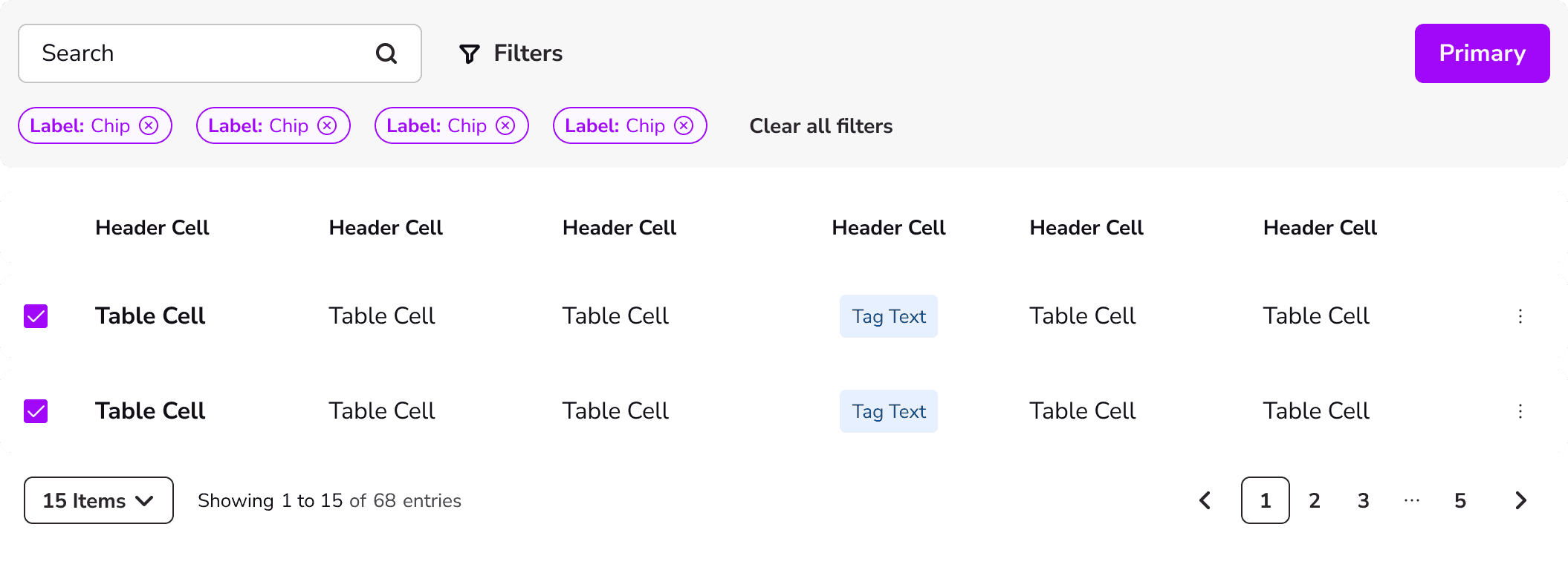
Display data in a structured format within a user interface. This component typically includes columns and rows, and can be enhanced with features such as sorting, filtering, and pagination to help users navigate and analyze large datasets.

Anatomy

Props

Figma

Table Template

Table Cell

Anatomy

Table Template

Table Cell

Props

Table Cell

Figma

Anatomy

Table Template

Table Cell

Props

Table Cell

Figma

Tab

Tab

Tag

Tag

Home

Components

Pricing

Help

Preview

Get CoreKit

© 2023 Abel Hancock.

Home

Components

Pricing

Help

Preview

Get CoreKit

© 2023 Abel Hancock.

Home

Components

Pricing

Help

Preview

Get CoreKit

© 2023 Abel Hancock.