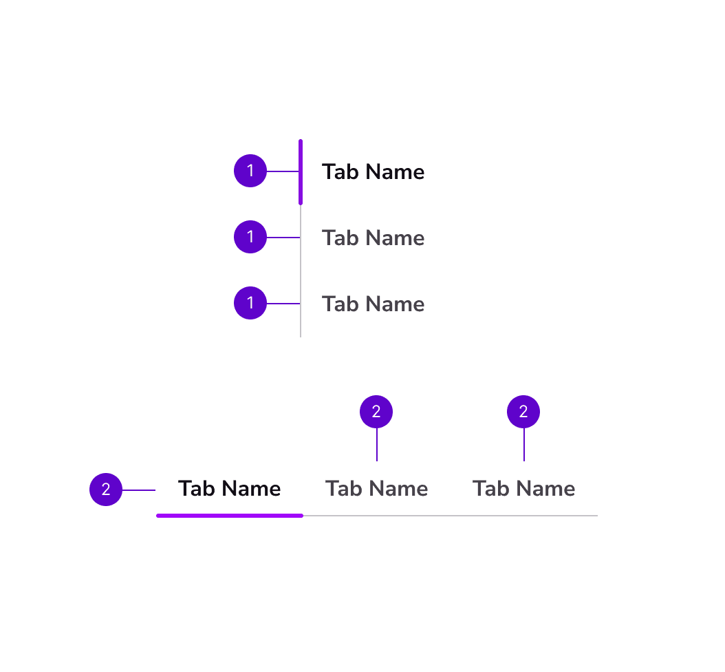
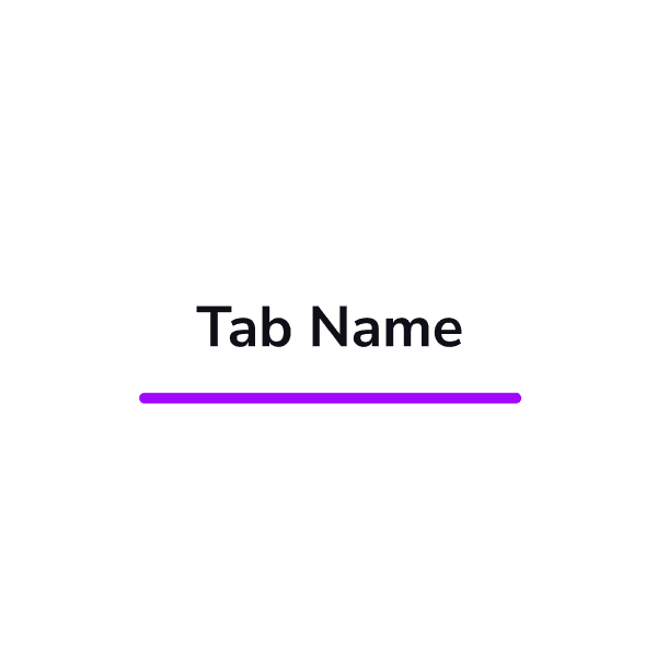
Home

Components

Pricing

Help

Preview

Get CoreKit

Menu

Menu

Home

/

Component Library

/

Tab

Component Library

Search

Documentation

Welcome to CoreKit
Batch Styler
Similayer
Customize Color Styles
Customize Typography Styles
Customize Component Styles

Styles

Colors
Elevations
Fills
Typography

Components

Accordion
Account
Alert
Announcement
Avatar
Breadcrumb
Button
Card
Checkbox
Chip
Dialog
Divider
Dropdown Menu
Form Stepper
Icons
Input
Modal
Navigation Links
Radio
Search
Segment Control
Select
Slider
Slot Component
Statuses
Surface
Tab
Table
Tag
Textarea
Toggle
Tooltip

Components

Accordion
Account
Alert
Announcement
Avatar
Breadcrumb
Button
Card
Checkbox
Chip
Dialog
Divider
Dropdown Menu
Form Stepper
Icons
Input
Modal
Navigation Links
Radio
Search
Segment Control
Select
Slider
Slot Component
Statuses
Surface
Tab
Table
Tag
Textarea
Toggle
Tooltip

Components

Accordion
Account
Alert
Announcement
Avatar
Breadcrumb
Button
Card
Checkbox
Chip
Dialog
Divider
Dropdown Menu
Form Stepper
Icons
Input
Modal
Navigation Links
Radio
Search
Segment Control
Select
Slider
Slot Component
Statuses
Surface
Tab
Table
Tag
Textarea
Toggle
Tooltip

Tab

Tab

Tab

Allow users to switch between different views or sections within an application or website. This component typically includes a row of buttons or tabs, each representing a different view or section.
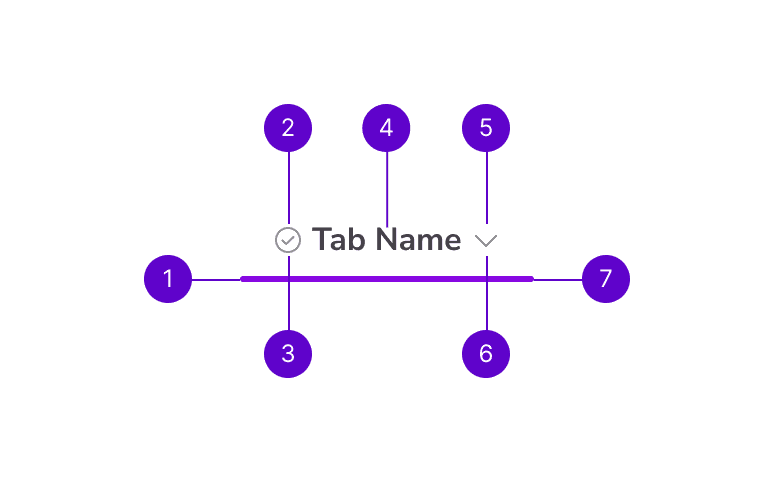
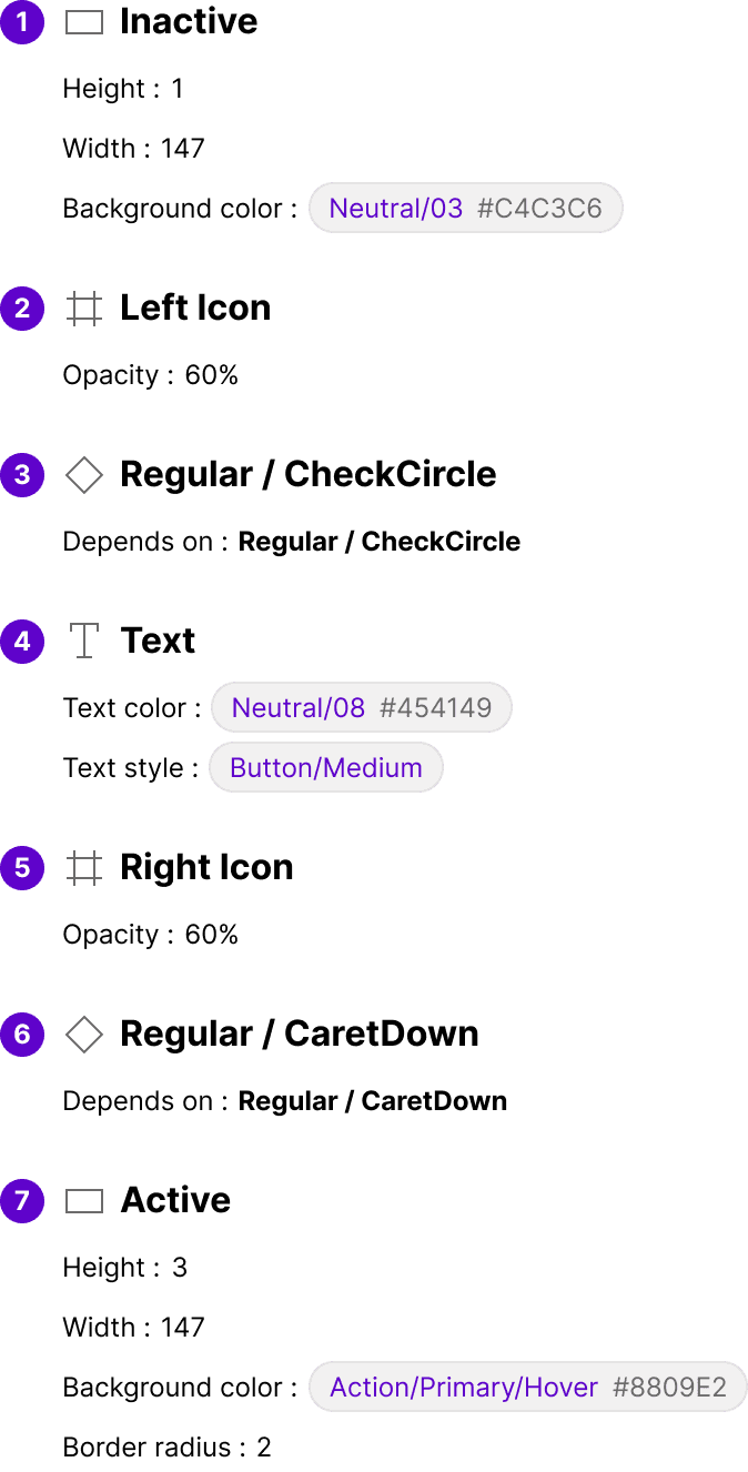
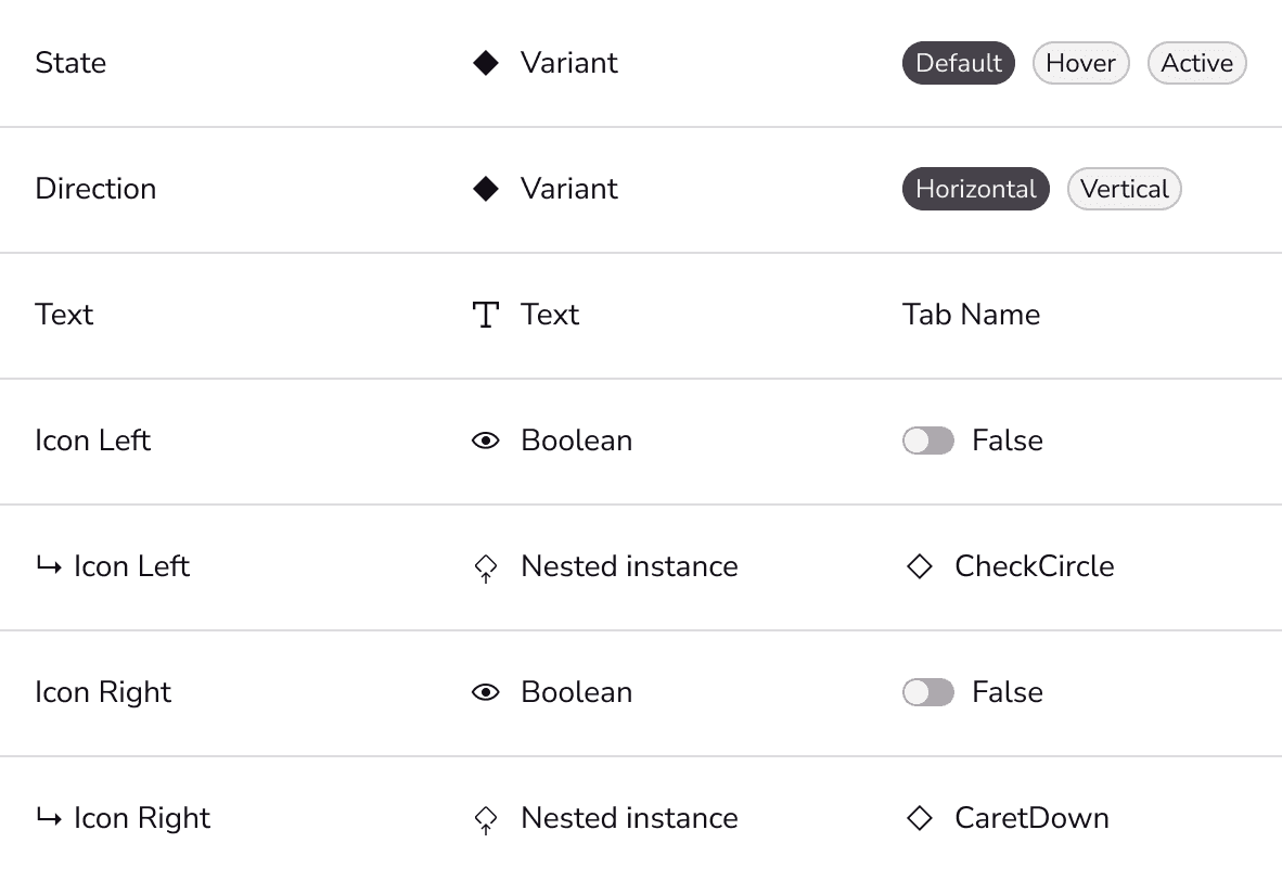
Anatomy

Props

Figma

Tab Group

anatomy-legend


Tab

anatomy-legend

Anatomy

Tab Group

anatomy-legend


Tab

anatomy-legend

Props

Tab Group


Tab

Figma

Anatomy

Tab Group

anatomy-legend


Tab

anatomy-legend

Props

Tab Group


Tab

Figma

Surface

Surface

Table

Table

Home

Components

Pricing

Help

Preview

Get CoreKit

© 2023 Abel Hancock.

Home

Components

Pricing

Help

Preview

Get CoreKit

© 2023 Abel Hancock.

Home

Components

Pricing

Help

Preview

Get CoreKit

© 2023 Abel Hancock.